TOP UP — CINEMATIC AD BREAKDOWN
A full commercial breakdown made in Wandura Cinema Studio — one can, one empty city, and a kid who levels up into an armoured striker.
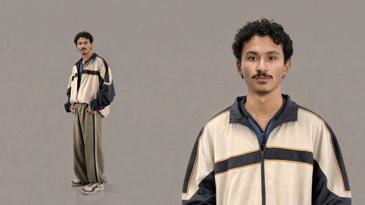
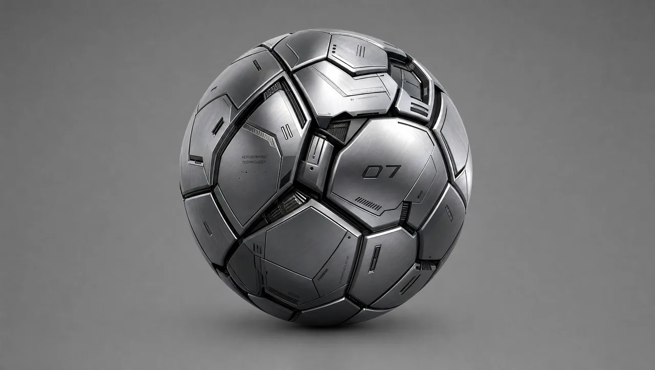
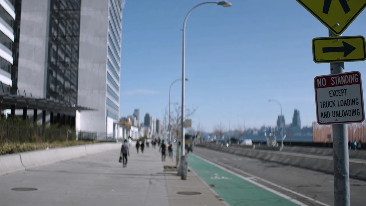
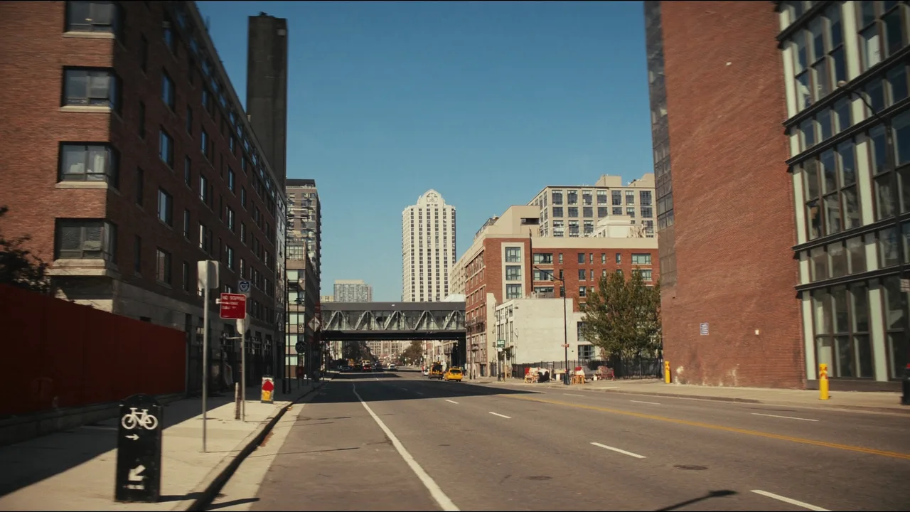
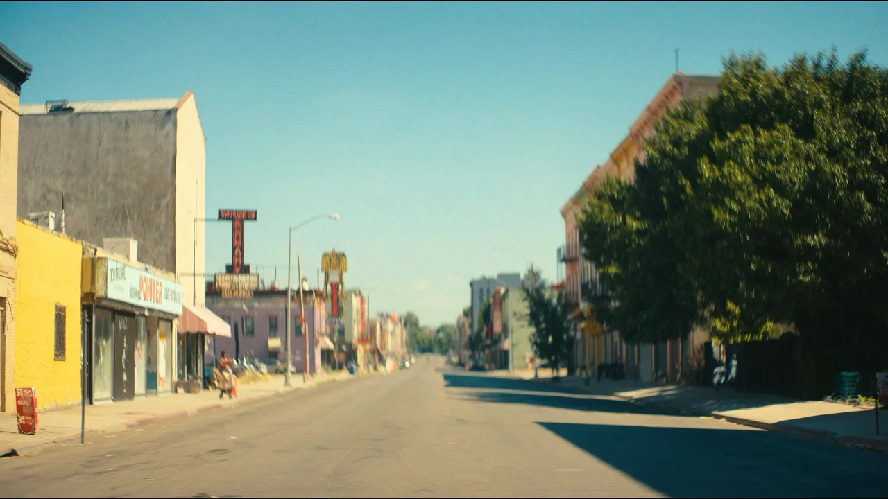
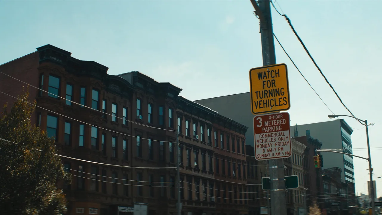
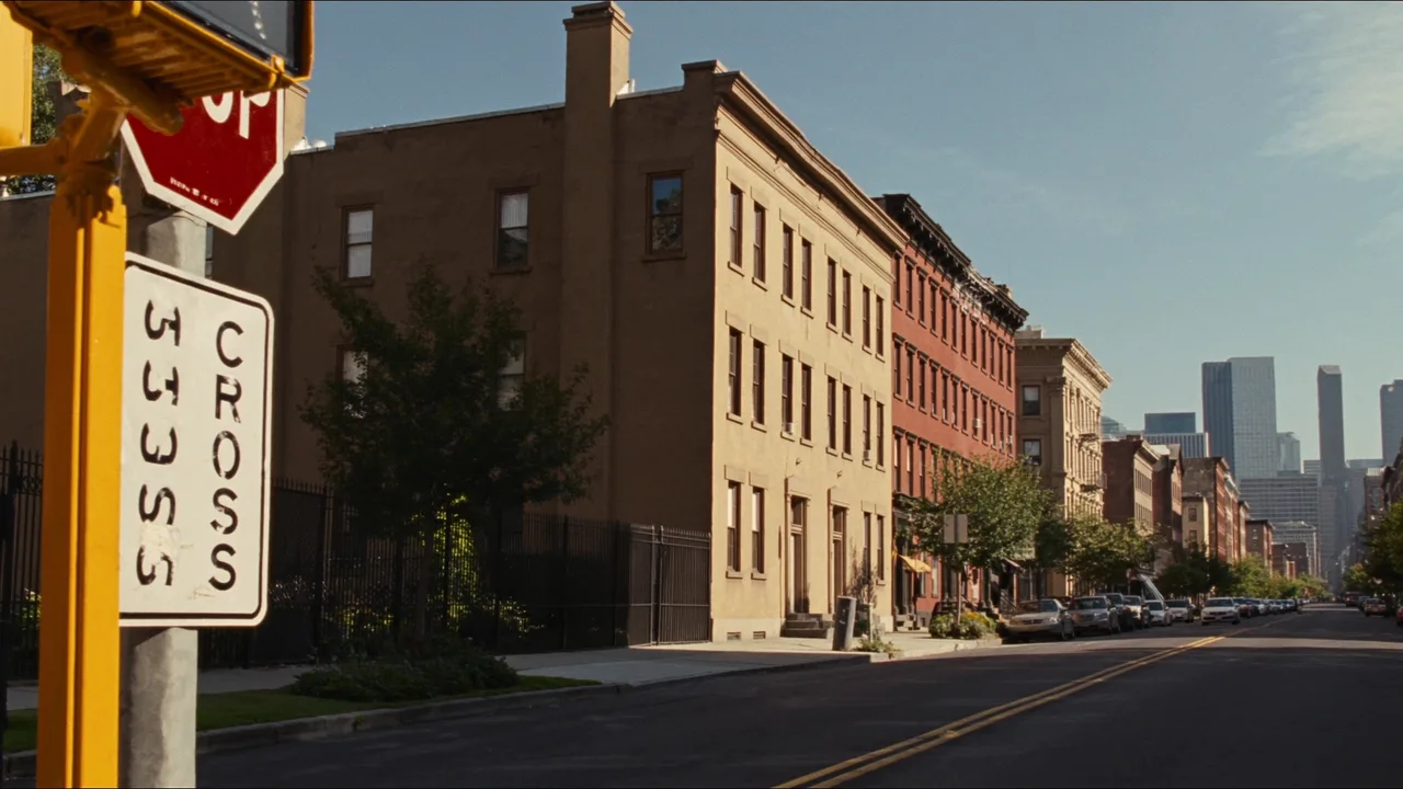
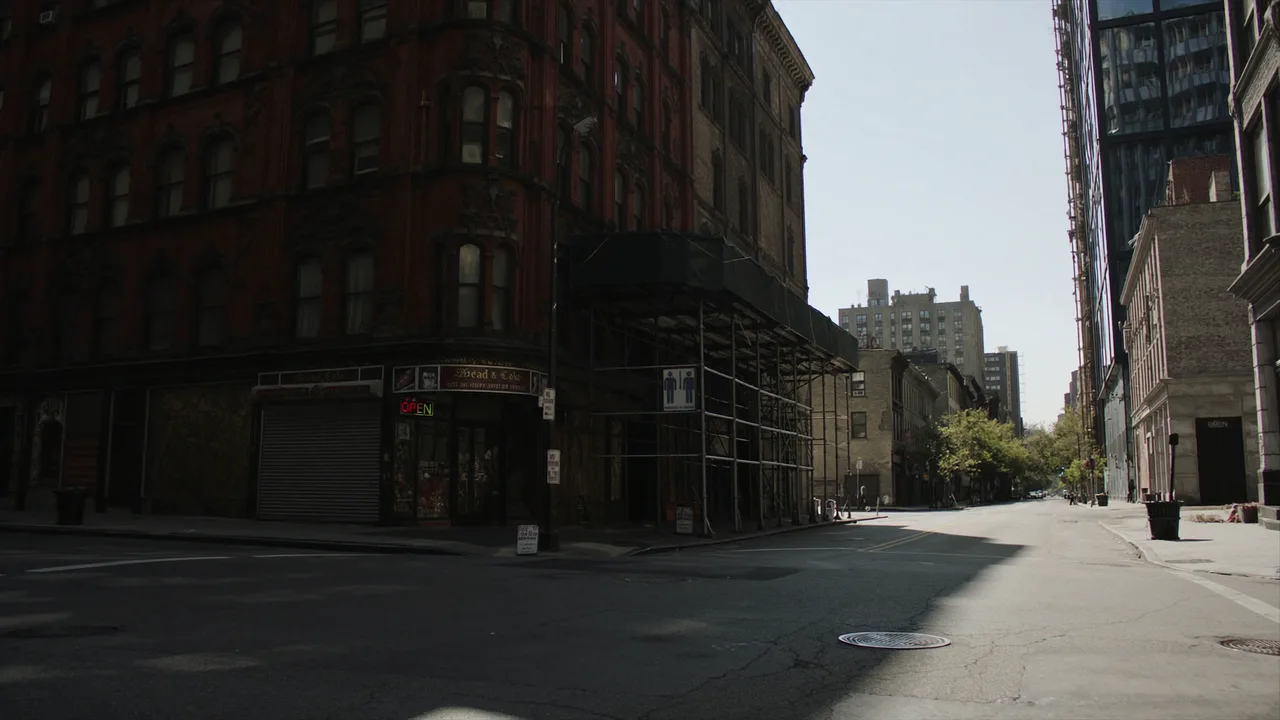
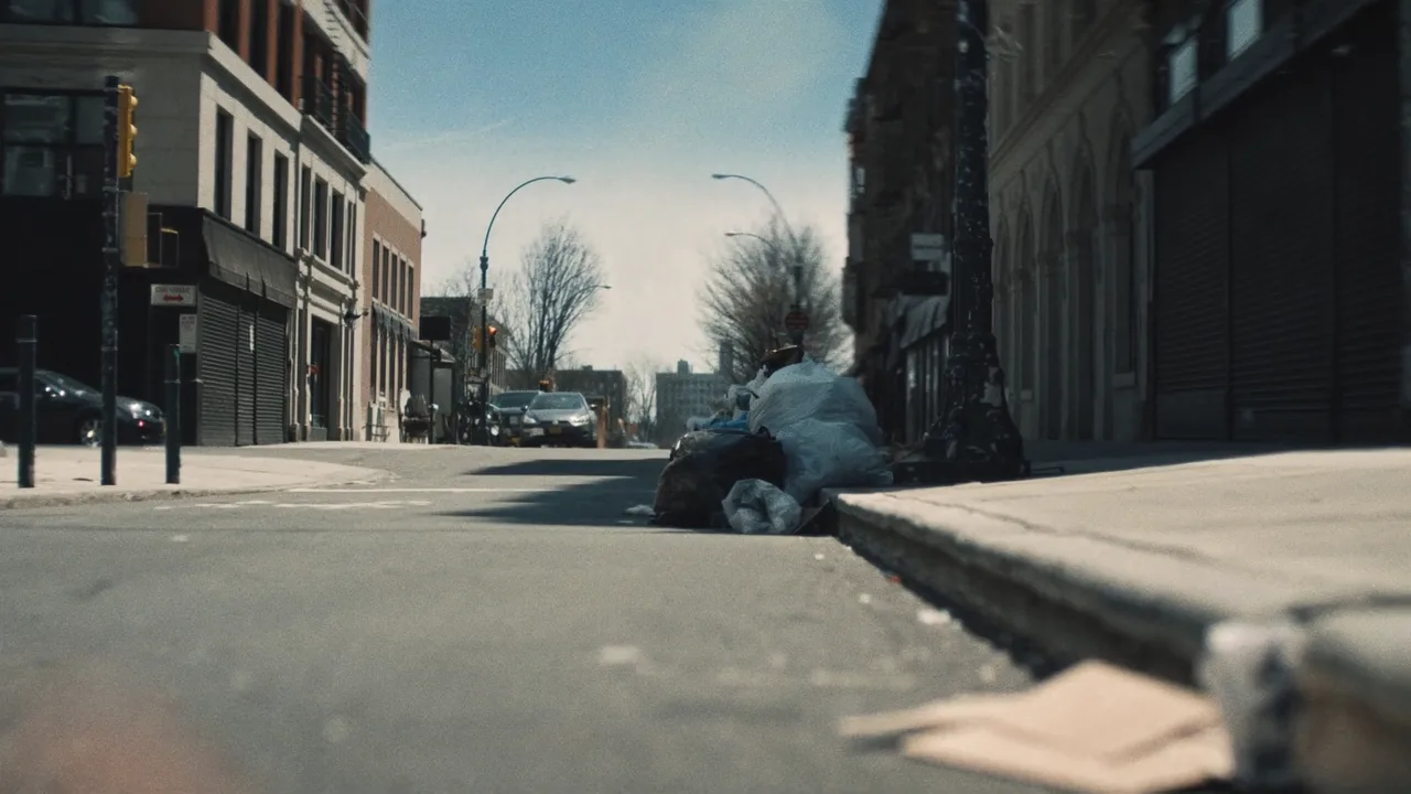
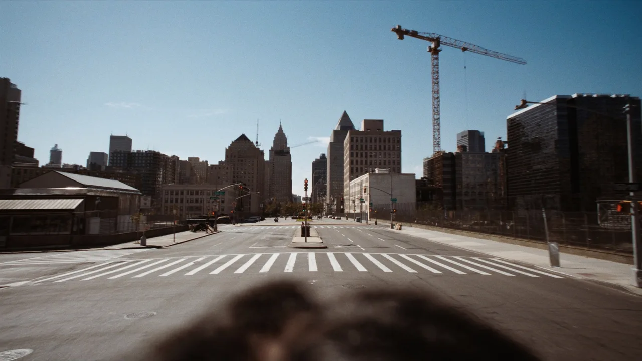
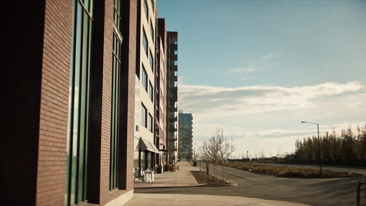
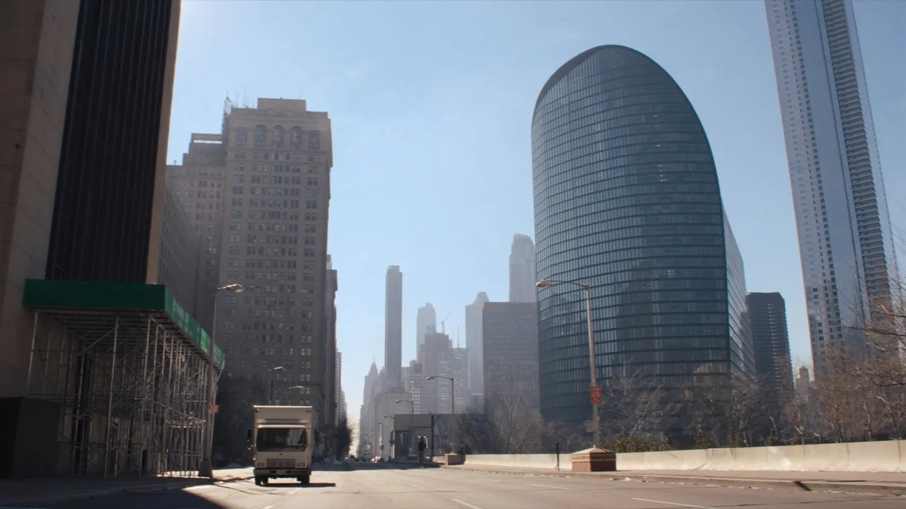
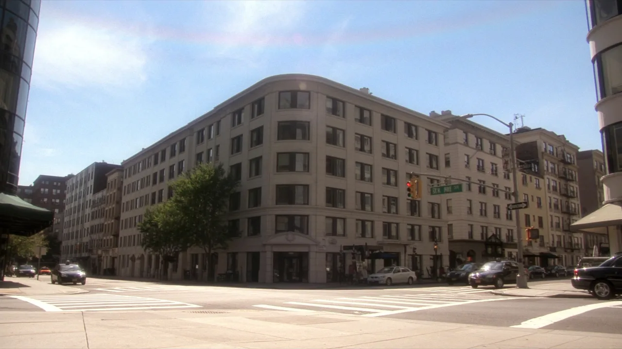
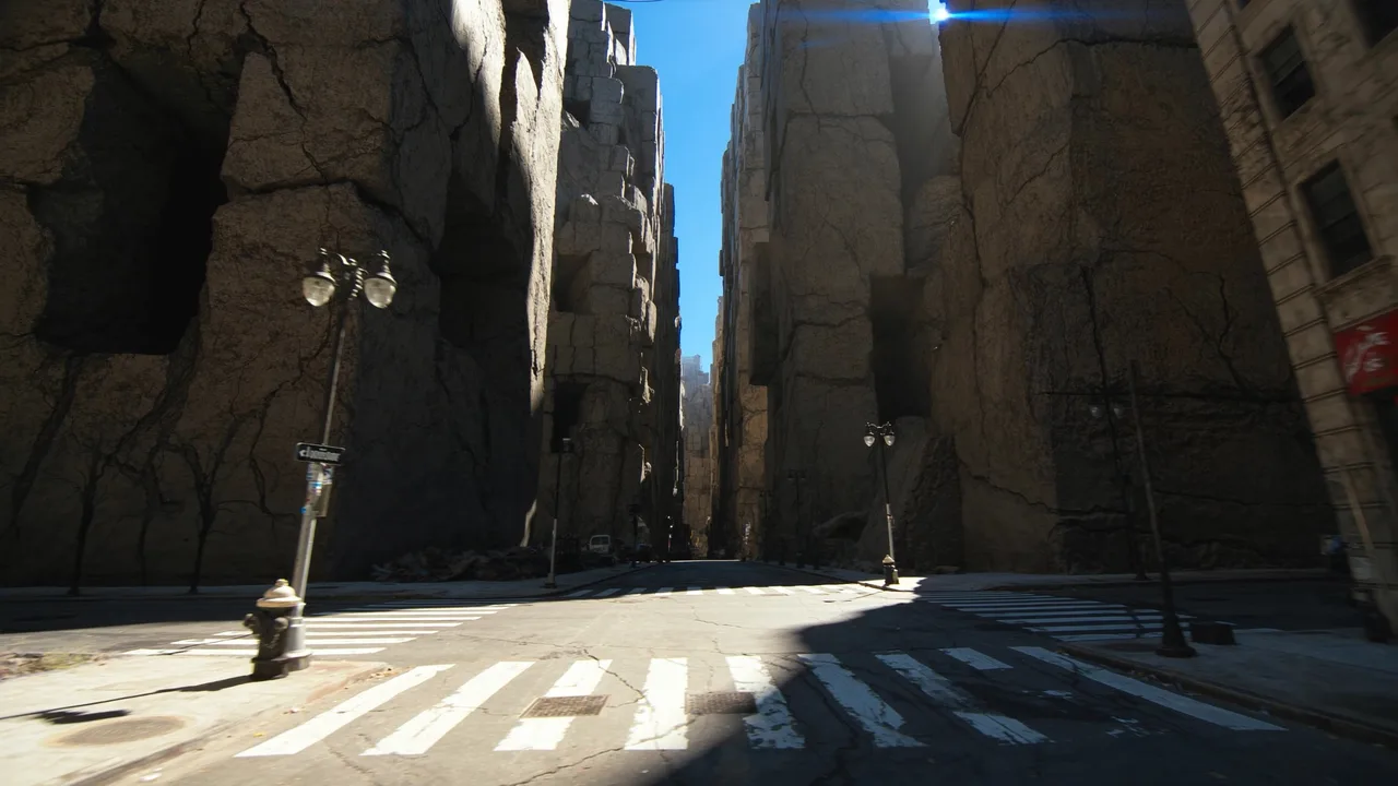
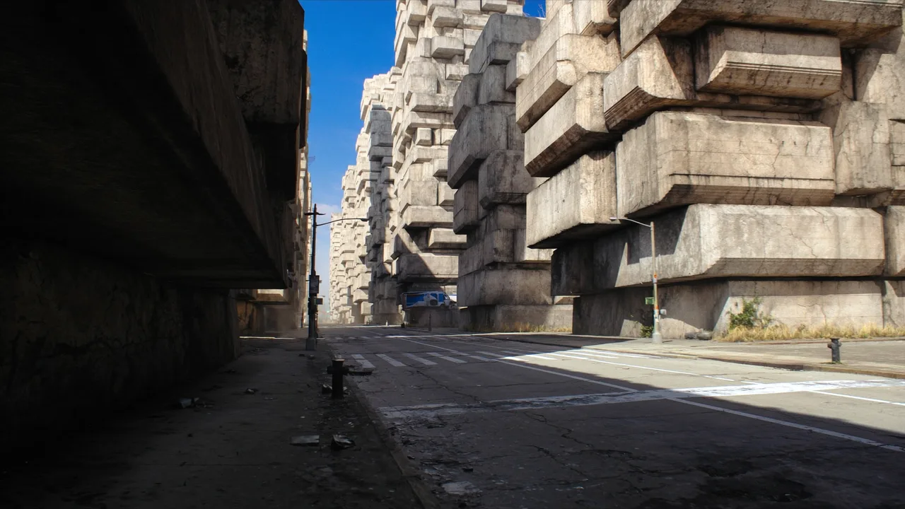
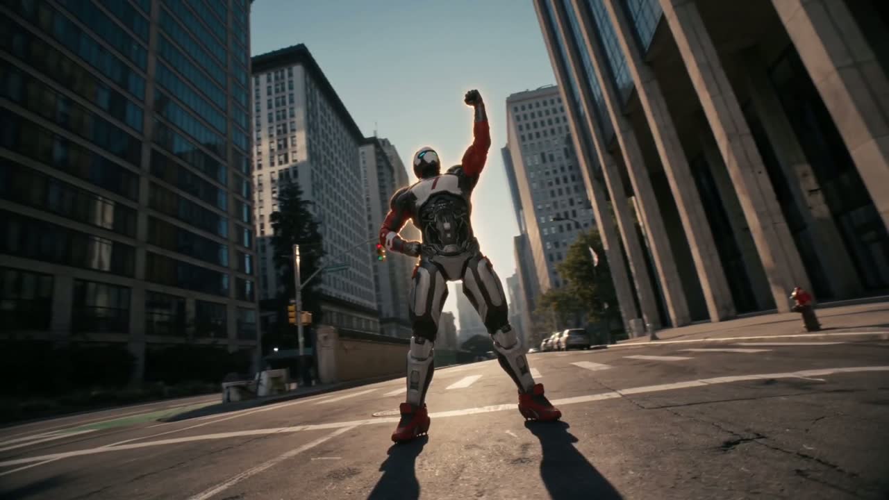
One sip turns an ordinary kid into the striker the empty city was waiting for.
Context
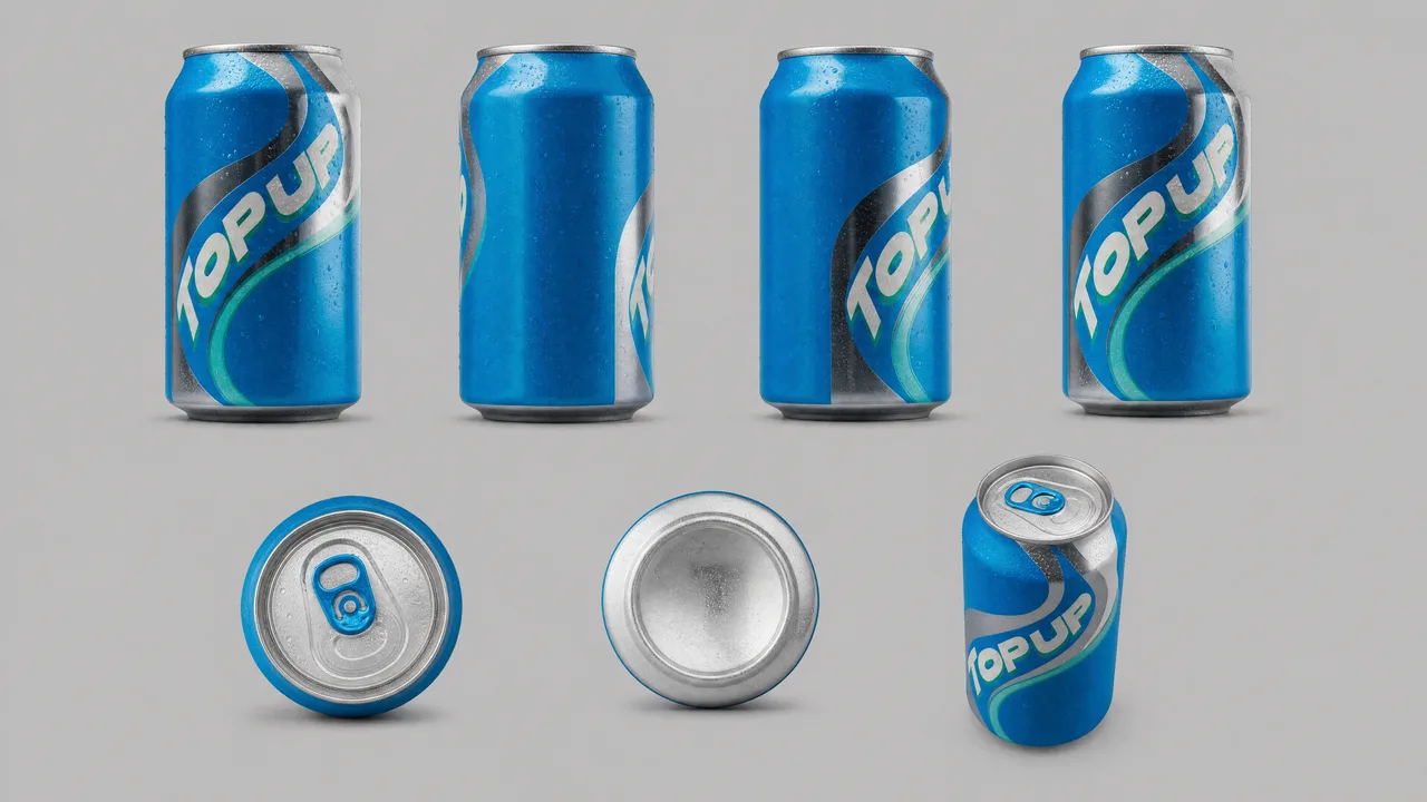
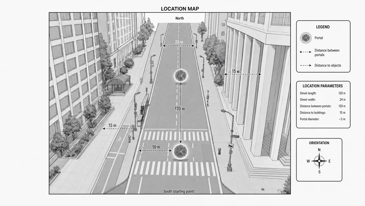
A commercial breakdown built the way an agency would board one: the product is rendered once as a brand asset, the hero is designed once as a character sheet, and the city is captured as empty plates. Every one of the 33 shots is generated against that same trio, so the spot cuts together like a single shoot day instead of thirty-three unrelated prompts. The point of the project is repeatability — a brand can swap the can label and re-run the whole board.
Narrative
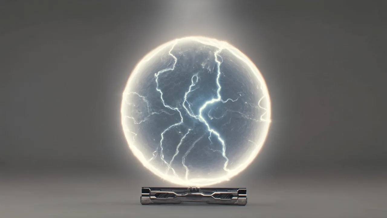
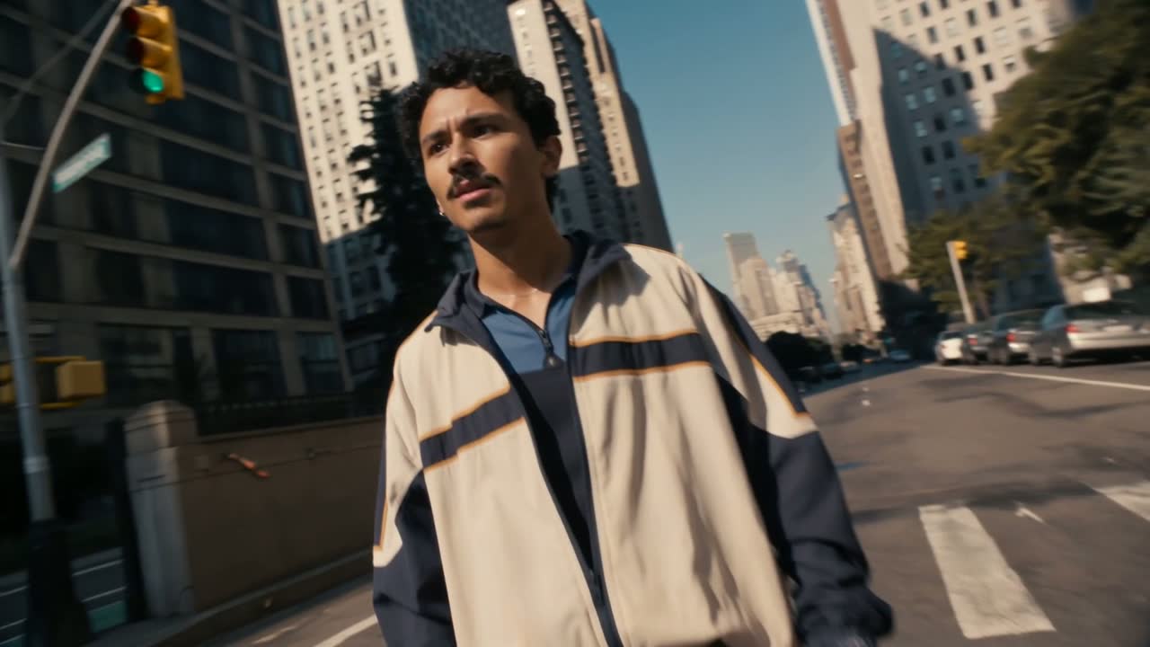
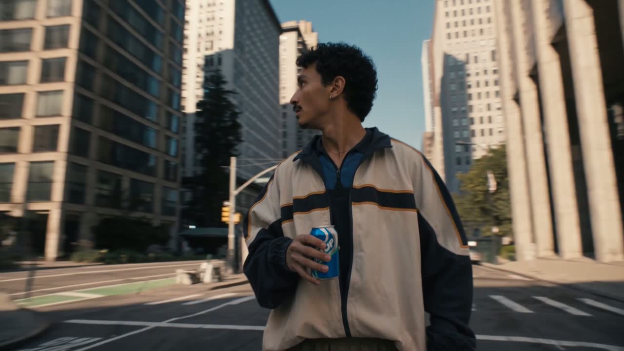
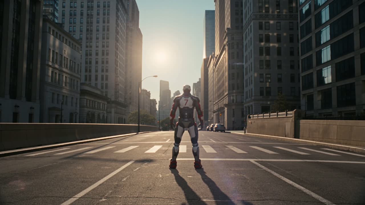
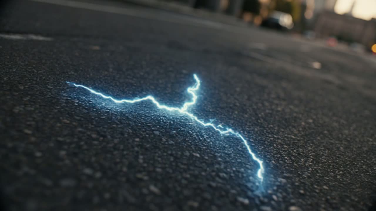
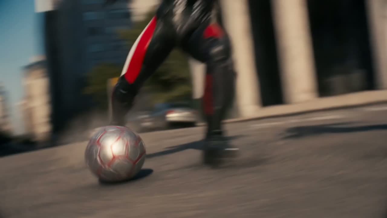
Story: A kid walks a downtown that has been emptied of everyone else. He drinks. The street answers with a ring of lightning, and he comes out of it in armour — then plays the match the city was cleared for.
Message: The product is the turn, not the decoration: the film is built so the sip is the exact frame where the world changes.
Audience: Brand and agency teams boarding product films who need the same hero, the same pack shot and the same city across dozens of cuts.
Visuals
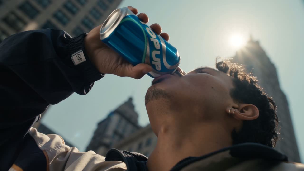
Hard low sun straight down empty avenues — teal shadows, orange highlights, anamorphic flare whenever the can passes the light. Wide 14mm FPV moves for the walk so the city feels oversized, then tight handheld for the sip so the product reads. The transformation is the only place saturated colour is allowed: electric blue, sourced from the label, used as lightning and rim light and nothing else.
Prompt Architecture
STYLE LOCK    ← immutable — the look (photoreal anamorphic commercial)
BRAND LOCK    ← immutable — can geometry, label, the one accent colour
CONTINUITY    ← immutable — hero likeness, wardrobe, empty-city geography
SHOT          ← the ONLY variable block — one beat per shot
Prompt Template
STYLE_LOCK = """
Photoreal live-action commercial, anamorphic framing with horizontal
flares and shallow focus. Hard low-sun key, teal-and-orange grade,
clean digital capture — no film grain, no cartoon read, no 3D look.
"""

BRAND_LOCK = """
The TOP UP can is identical in every frame: same proportions, same
blue label, same typography as the product render. Electric blue is
the ONLY saturated colour in the film and it always comes from the
drink — lightning, rim light, screen glow. Nothing else glows.
"""

CONTINUITY = """
The hero stays visually identical across every shot — same face,
same cream-and-navy tracksuit before the turn, same armoured kit
after it. The downtown geography (avenue, crosswalk, warehouse
block, skyline) stays fixed so the walk reads as one street.
"""

SHOT = """
[the one variable per shot — e.g. "Shot 19: tight low angle, he
tips the can back, sun flares behind the label, slow push-in"]
"""
Comments 44
Sign in to join the conversation.
Rendering the can once and treating it as a locked brand asset is the whole trick. Our packs kept mutating between shots until we did exactly this.
The empty city is such a cheap way to buy scale. No crowd continuity to fix.
One accent colour sourced from the label — stealing that rule for our next spot.
How many tries for the transformation ring? That is the shot my client would ask for twelve times.